The Key To Selling More Beaded Jewelry
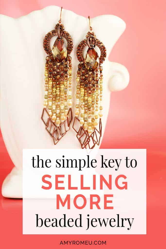
I designed a new pair of earrings today and I’m SO excited about them.
I’ll show them to you in a bit, but first I wanted to share WHY I’m so excited about them, and share a quick and easy tip that will really help you sell beaded jewelry.
It’s not that these earrings are nicer than anything else I’ve designed. Or because I’ve used my favorite bead colors. Or because these beaded earrings make my heart sing (which they do, by the way!).
I’m excited about them because I know they will SELL.
Well, I don’t know for a FACT they will sell, not yet. But I’m pretty darn sure.
And I know they will sell because I did one small – but REALLY important thing – before I made them.
Before we get into that, however, let me tell you a quick story.
My Gorgeous Piece That Didn’t Sell
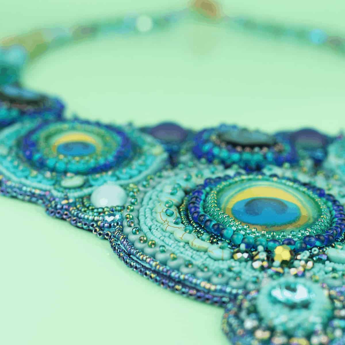
A few years ago, I found the most amazing labradorite cabochon on Etsy. It was dark and moody, with flashes of pinks, purples and golds. It was glorious. I bought it and eagerly waited for it to arrive in the mail.
When it arrived, I immediately got lost in the excitement of creating. I looked for beads that coordinated back to colors in that to-die-for cabochon and pulled them all together. Black! Garnet! Shades of deep purple! A touch of dark golden yellow!
The colorplay was so much fun. Before I knew it, I had pulled together an entire project’s worth of beads and I got started.
The final piece was gorgeous! I had a table at a craft fair coming up and I couldn’t wait to show it off along with my other pretty beaded jewelry pieces.
I took it to the craft show and, to my dissapointment, it didn’t sell. It just sat there. It was so pretty! I couldn’t understand it.
What Went Wrong
Not only did it sit there, it stuck out like a sore thumb. Why?
Did I mention the craft show was in the summer? In Florida?
Maybe you already know what went wrong.
The answer in this case was simple. Color choice.
My color palette was all wrong. The colors were not in style. My beloved necklace didn’t match with or relate to seasonal fashion colors.
A typical Florida shopper in her bright pink sleeveless tank, white capris and cute sandals was not looking for a dark and elaborate beaded necklace. Even it we weren’t in Florida, no one was going to buy it because it didn’t “go” with any of their clothes in their wardrobe.
Even more so, if they went to the store to buy something new, my necklace wasn’t going to match the clothing in the stores, either.
After that experience, I had to take a step back from my bead enthusiasm and look at my work differently to figure out why that piece – and other creations I was so proud of – weren’t selling.
The reality is, I was creating jewelry in a vacuum and I wasn’t considering how my customer bought jewelry.
Know Your Beaded Jewelry Customer
I was only thinking about the process of making the beaded jewelry, not the end product with the customer in mind.
To increase my sales, I had to acknowledge that buyers buy jewelry to match an outfit, or to wear with clothes they already own and love. They don’t buy a beaded necklace or earrings and THEN figure out what to wear.
If I wanted to sell jewelry, I had to fufill their need for a gorgeous piece of jewelry that goes with a few favorite pieces in their wardrobe.
The Solution
The solution – and my quick tip – is to design beaded jewelry with fashion trends and seasonal colors in mind from the very beginning.
Sounds easy, right? But sometimes it’s hard to stay focused on the desired result of selling your jewelry when you’re deep into the process of creating it.
But when you begin the creation process with the end result in mind, you’ll end up with beaded jewelry pieces that sell better. That’s what I’ve done here with my new earrings:
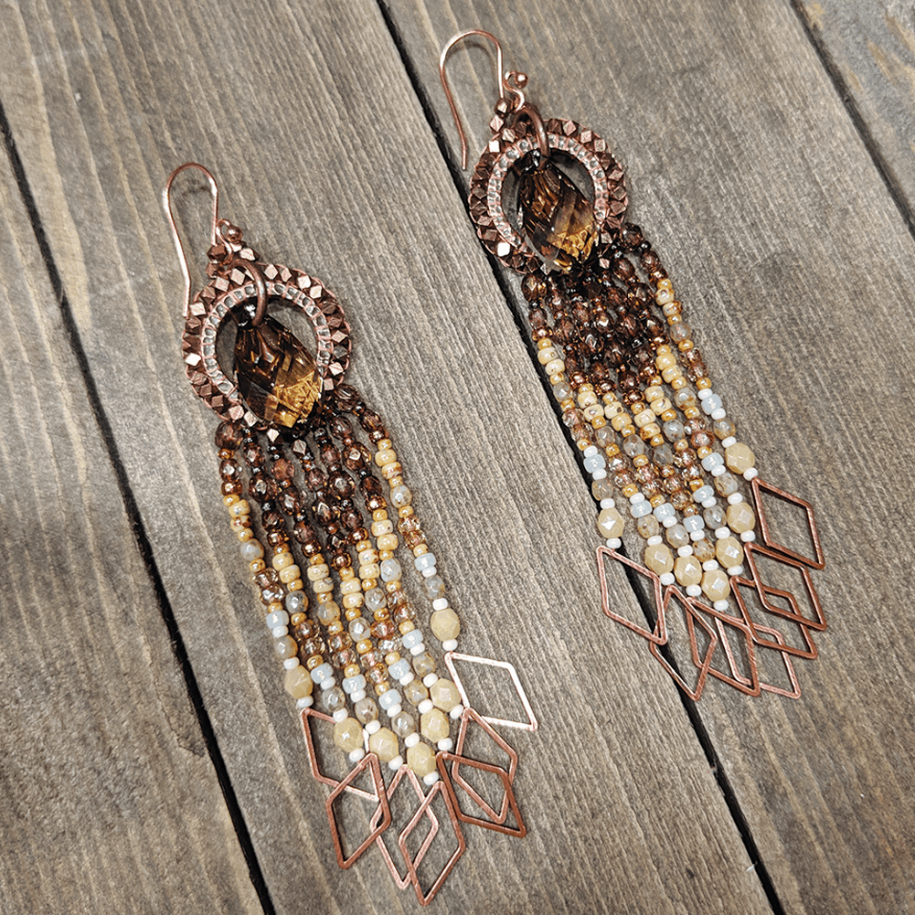
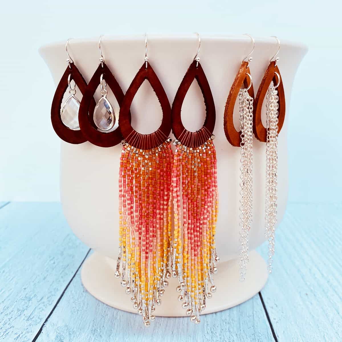
I’m crazy over this pair of drippy earrings in shades of cream, butterscotch, and rich cocoa brown. The earwires, beaded rings, and fringe dangles feature an antique copper finish. The flowy bead fringe is made with an ombre effect of Czech crystals and Japanese glass seed beads.
By the way, the large Colorado Topaz Swarovksi teardrops are stunning in person! I’m a little obsessed with them and they come in so many amazing colors. If you want to see more colors, check out the great selection at Fire Mountain Gems by clicking here.
So how did I pick the color palette for these beauties?
One Way To Identify Future Fashion Color Trends
I admit… I had more than a little help from the nice folks at Pantone®, the color experts.
You may remember that I recently wrote a post about foolproof tips and tricks to choose beading color palettes in a hurry. To read that post, click here.
For these earrings however, I used another bead color design technique:
I visited the Pantone® website and checked out their online resources for fashion designers. You can find the fashion resources by clicking on Color Intelligence from the top menu, then the Fashion Color Trend Reports tab, and then selecting the season you are interested in.
Pantone® does an amazing job of creating seasonal color boards from New York and London fashion week.
They pull together “mood boards” of looks and elements from fashion week by season, and then highlight specific color swatches that tie back to the mood board. It is a quick and easy way to see what colors are in style right now, and also the colors we’ll be seeing in stores in the next 6-12 months. It’s genius!
Here’s a look at the “mood board” for Spring\Summer 2019. You can also click here to see this board online.

And a small selection of the coordinating color swatches Pantone® creates from the board. Click here to see all of the color swatches from the Fashion Week Spring/Summer 2019 board online.

The fashion colors for Spring/Summer 2019 are vibrant as you can see, but they also featured a small selection of neutral color choices which work well with the fashion colors for summer:

Do any of those colors look familiar when you look at my new earrings? 🙂
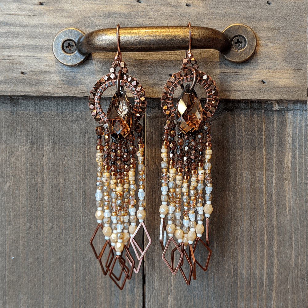
That’s right, I put the “Summer Neutrals” palette and Sweet Cream, Soybean, and Brown Granite to work in my earring design. Easy peasy!
I love how they came out, and I feel good knowing they will work back to many seasonal pieces in my customers’ wardrobe.
The Takeaway
As beaders and jewelry designers, it’s easy for us to get wrapped up in the artistry of a jewelry piece while creating it. However, if your goal is to sell your work, it’s important to remember that jewelry is a fashion accessory, and meant to be worn as a complement to an outfit.
To that end, if you can design your beaded jewelry piece with fashion colors in mind, you’ll reach a broader audience and sell more jewelry. You can easily research current fashion trends by visiting your local clothing store, reading fashion magazines, and visiting the Instagram pages of your favorite lifestyle bloggers. To identify future fashion trends and colors, you can use the tools available at color professional websites like
Pantone® for help.
By taking a few moments to look at current and future fashion colors before you settle on a bead color palette, you’ll be setting yourself up for success.
Do you look at fashion color trends before designing a new jewelry piece? Or do you work from the heart and follow where you inspiration takes you? Let me know in the comments below.
Until next time… and happy creating!
Want to remember this? The Key To Selling More Beaded Jewelry to your favorite Pinterest board!

As a beaded bracelet making newbie, I needed to se this! Thank you!